
NOV Design System
NOV had outgrown the tooling it was designed in. I led the ground-up migration of its design system from Sketch to Figma — restructuring, documenting, and aligning it to Material Design 2 so every product team could build from the same foundation.
Background & Problem
MAX Portal gives energy operators live visibility into fleet-wide performance, so crews and office teams can make faster, better-informed calls — from the worksite or the boardroom. Behind that experience sat a design system built in Sketch that had quietly outgrown its own tooling: inconsistent components, undocumented rules, and no clear source of truth for teams shipping new features.
Objectives:
- Migrate the design system from Sketch to Figma without breaking continuity for teams already shipping on it.
- Establish clear design standards and documentation — components with explicit rules for when, how, and why to use them.
Four decisions that made the migration manageable
1. Split the library
The system was split into separate sub-libraries, each covering a different part of the ecosystem — so migration could move in organized chunks instead of one monolithic transfer.
2. Lean on styles
Figma's Styles work like Sketch's Text Styles, but extend to color and effects too. Consolidating every shared value into one documented library did most of the heavy lifting.
3. Organize properly
Frames were structured logically, colors/type/shadows/grids were pushed into styles, and every component got its own page — so the library reads clearly to anyone, not just its author.
4. Import vs. rebuild
Simple pieces like icons imported cleanly from Sketch. Anything with masks or nested symbols was faster and more reliable to rebuild from the ground up in Figma.
Full library documents Primary, White, and Black surfaces × Default, Hover, and Disabled states for each button type — 36 documented combinations in total. Try hovering the buttons above.
Click into the default field — focus, error, and disabled states all carry distinct color and border tokens documented for both light and dark surfaces.
The full picker covers quick ranges, custom ranges, and relative ranges, each documented in both light and dark theme.
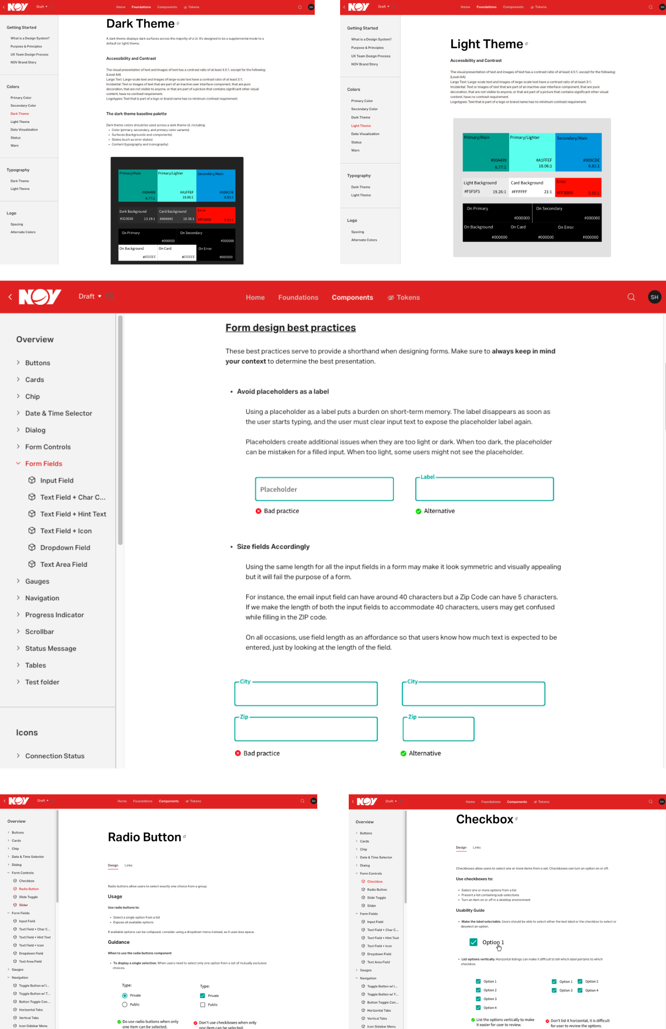
Selection controls follow the same guidance model as every other component: usage rules, accessibility notes, and do/don't pairs.
-Documentation & GuidelinesRules, not just references
Every component page paired the visual spec with a best-practices guide — because a system only works if people know when and why to use each piece.
Impact
The result wasn't just a component library moved from one tool to another — it was a documented, opinionated system that product teams could actually build on without guessing. Every component shipped with rules for when, how, and why to use it, in both light and dark theme, reducing the back-and-forth between design and engineering on day-to-day builds.
+ One documented source of truth, replacing scattered Sketch files across teams.
+ Every component paired with explicit usage guidance — not just a visual spec.
+ Full parity across light and dark theme, verified for accessible contrast.