
AtriCure - AtriHub Redesign
AtriHub is the content tool AtriCure's surgical reps carry into hospitals. I rebuilt it around the one condition its predecessor treated as an exception: no connection.
Background & Problem
AtriCure makes devices for cardiac surgical ablation and left atrial appendage management. Its reps don't sell in conference rooms — they sell in scrub corridors, pre-op bays and basement equipment areas, in the gaps between a surgeon's cases.
That setting sets every requirement in this project. The rep has maybe sixty seconds of a surgeon's attention. They need one specific asset — a study summary, a procedure video, a patient brochure — for one specific franchise, and they need it while standing still, on an iPad, often with no bars.
AtriHub was the tool for that job. It had stopped being able to do it.
What the legacy app assumed.
Legacy AtriHub was desktop-first and sidebar-driven — a browsable library. It hadn't kept pace with how reps actually work: increasingly on iPad and iPhone, increasingly offline, and across a growing set of franchises with an international integration on the way.
FAILURE 01
Retrieval was too slow for the moment it served
Finding the right asset mid-conversation took longer than the conversation allowed. Browsing is fine for a library; it's useless at a surgeon's elbow.
FAILURE 02
No signal meant no product
Content wasn't reachable without a connection — and no connection is the norm in ORs and hospital basements. The app failed silently exactly where it mattered most.
FAILURE 03
Everything looked equally important
Content was undifferentiated. Nothing told a rep what was new, what was relevant to their franchise, or what had been vetted for external use..
Exploration: Listening Before Designing
Before locking any screens, I ran a structured feedback loop:
Prototype review sessions with reps, validating early static design direction
Franchise-specific focus groups, structured around three questions: How do you currently work? What do you like/dislike about today's tool? What are your top unmet needs?
Design Q&A sessions to pressure-test preferences and surface future-scope considerations without letting them derail the MVP
This is also where the international (OUS) team's requirements started to diverge meaningfully from the US experience — different content classifications, different printing rules (Quantum print integration is US-only), different default franchise views. Rather than design two products, I built a single role-aware system that flexes presentation based on user type — detailed below.
Key Design Decision
DECISION 01
Offline as a first-class mode, not a fallback
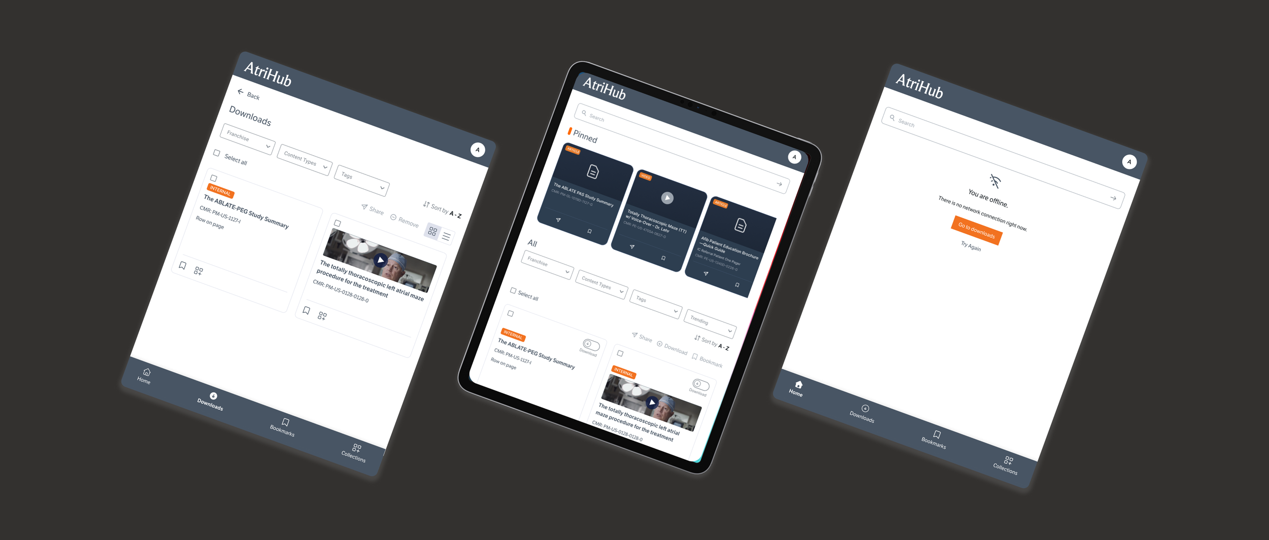
This was the architectural heart of the redesign. Rather than caching opportunistically behind the scenes, I made offline an explicit act the rep performs and can see.
Visible toggles to mark individual files, batches, or whole Collections as Available Offline — defaulting to online-only, so device storage is never consumed without intent.
Honest download states — Downloading and Available offline, storage warning — so the rep knows what they're actually carrying before they walk into the hospital.
A "You're offline" message, so a rep understands why something isn't working instead of hitting a silent dead end. Easy “Go to downloads” button to access downloaded items while offline.
DECISION 02
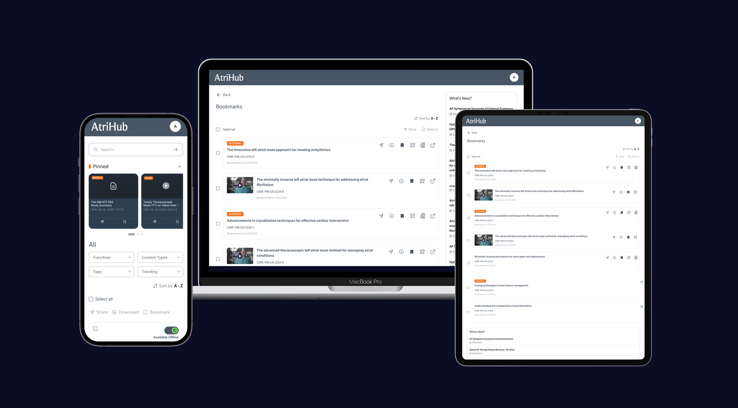
Collections as the rep’s personal workspace
Reps build curated sets of materials for a specific account, surgeon or procedure. Collections are where the corporate library becomes a personal kit.
Unlimited creation, with reordering, and moving or copying files between Collections.
Sharing at two levels — a whole Collection, or a single file from inside one.
Classification that travels with the file: internal content stays visually flagged and access-restricted no matter which Collection it lands in.
DECISION 03
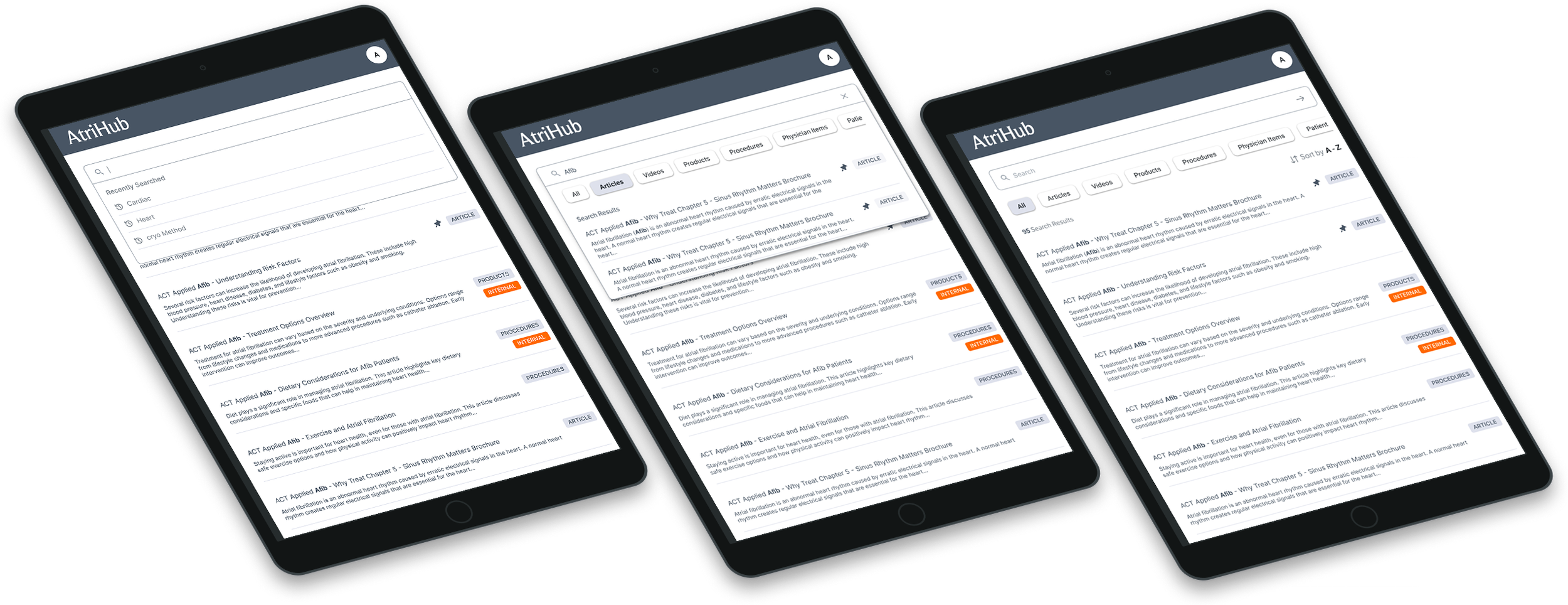
Search built for two states: online and offline
Search couldn't be treated as a feature. Once offline is the working state, search becomes two systems querying two different sources, and the rep has to be able to trust both.
Connected, it's type-ahead and real-time against the full index. Disconnected, it's a functionally parallel experience querying a locally synced database — the same filters, the same interaction model, the same result cards. What differs is scope, and the difference is stated rather than discovered: internal-only tagging, no cross-network sharing.
DECISION 04
Franchise-first navigation, not feature-first
Reps don't think in terms of app features — they think in terms of "what does cryoNB have that's new." I designed the primary IA around franchise context (Cardiac Surgery, Hybrid AF Therapy, cryoNB, Extremity), with content type, tagging, and trending status as secondary filters layered underneath. The legacy app's sidebar-and-list pattern was the right instinct but needed to be rebuilt mobile-first and made filterable, sortable, and shareable consistently across every content surface — search results, profile/franchise landing, bookmarks, and downloads.
Impact
Retrieval too slow
Franchise-first IA plus type-ahead search on every surface; the rep narrows by the value that never changes, then searches within it
Unusable without signal
Explicit offline mode with rep-controlled downloads, local search, cached auth and stated system messaging.
Undifferentiated content
New, trending and internal status carried as visible properties of the content row across every surface
Client Review
"I've had the fortune of working alongside Shreya on several Design initiatives for the past 4 months. And in that time, she's quickly impressed me with her knack for intuitive decision making and ability to understand needs rapidly. She's been a valuable partner in bouncing ideas off each other as we consider different directions for different interaction patterns. She offers sound reasoning and rationale for her Design approaches and is ready to dive deeper, if needed. She seems especially considerate of maintaining consistent design systems and ensuring that adjacent experiences are tied together in a meaningful way. I've enjoyed focusing on Design problems with her as a creative partner, and would welcome the opportunity to work with her anytime."— Scott Hoverman, Principle Design Lead @ AtriCure