
Rebuilding the submission experience for Mission
A six‑year‑old underwriting platform, a nine‑week deadline, and a broker‑facing rebrand that couldn't slip.
Background & Problem
Mission Underwriters had been running on the same submission platform for over six years. The system worked — until it didn't. As submission volume grew and the product team expanded what underwriters could quote, the UI accumulated without ever being rationalized. Tabs nested inside tabs. Modals triggered from within modals. A single submission review could span four different screens with no clear through-line.
I was brought in after the business had already committed to a relaunch. The target date wasn't a suggestion. A broker-facing rebrand was tied to the platform readiness, which meant slipping the timeline would cascade into a PR problem. Nine weeks was the constraint. I didn't negotiate it — I worked inside it.
Exploration
I had one week to understand underwriter behavior before I needed to be sketching. Rather than mapping every edge case, I focused on identifying the highest-friction moments in the existing flow. I ran four contextual sessions with underwriters directly in the legacy platform, watching where they hesitated, where they opened workaround spreadsheets, and where they verbally noted something "doesn't make sense here."
The screenshots below are what underwriters were navigating every day. No annotation needed — the problems are visible.
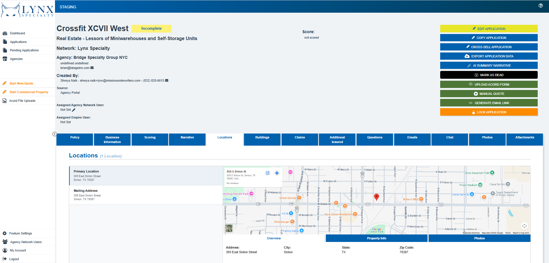
Status badges use three different visual languages — color, label, and shape — inconsistently across rows
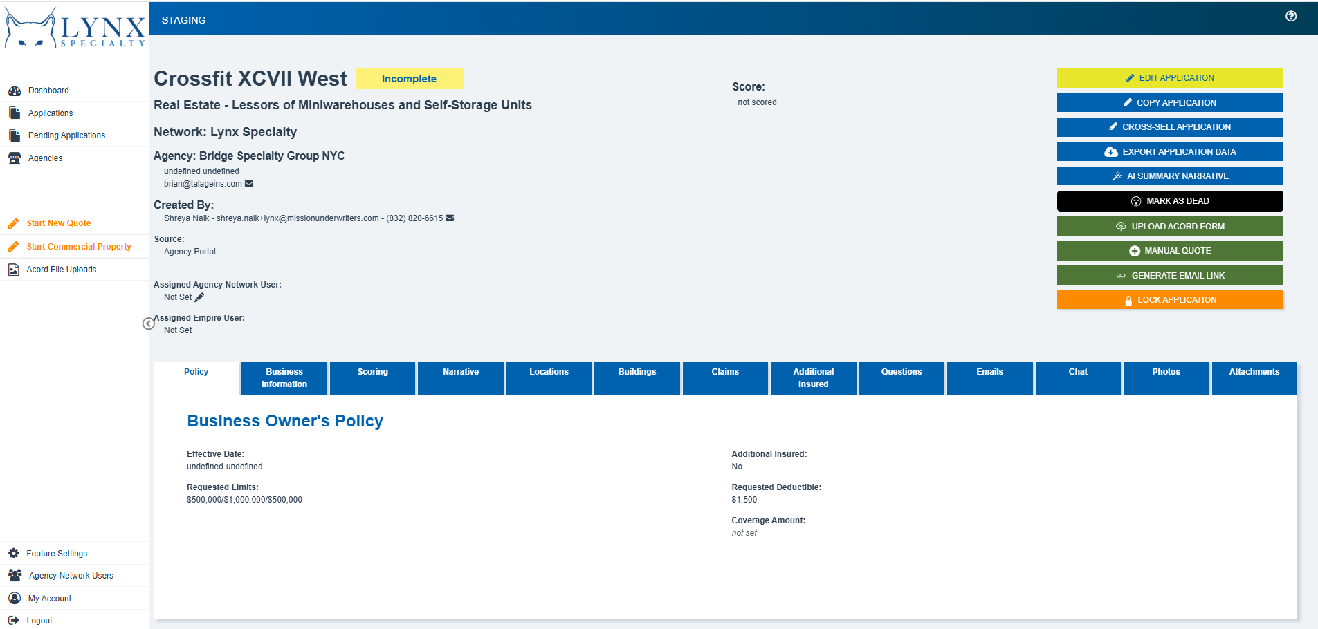
8 action buttons in 4 different colors (yellow, blue, black, green, orange) with no visual hierarchy — Edit, Copy, Cross-sell, Export, AI Narrative, Mark as Dead, Upload, Lock all compete at the same weight
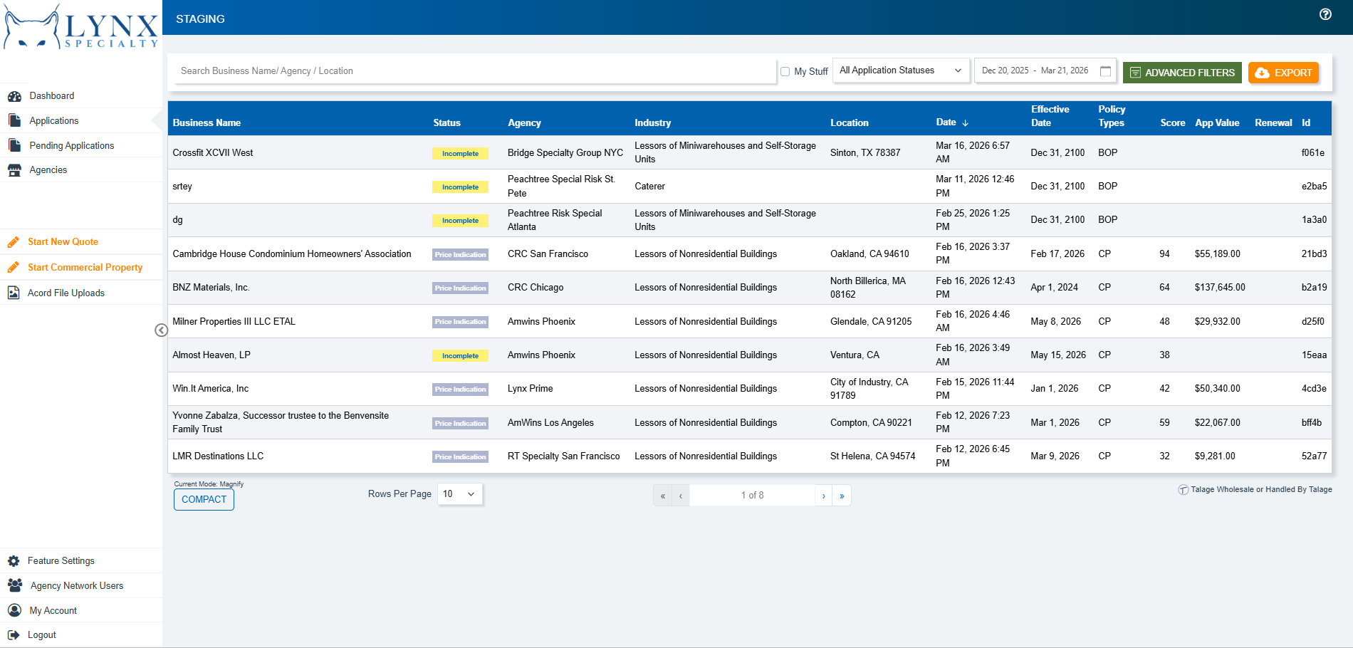
Too many Attributes on left side with some null and some assigned fields shown as plain text with no clear path to act on them
Findings
“Underwriters couldn't determine submission status at a glance. Every review started with archaeology — clicking through tabs to reconstruct context.”
“The coverage configuration screen had 47 visible fields. Most underwriters used 8–12 consistently. The rest created noise and slowed decision-making.”
“Quote approval required sign-off from a supervisor, but there was no in-platform path to escalate. The workaround was email, which broke audit trails.”
I aligned business and user goals before designing anything
Before I showed any wireframes, I met with the Head of Underwriting Ops and the Product Lead—not to get approval, but to uncover anything the business hadn’t said out loud. Every time I skip this step, it comes back to bite me.
What the business needed
Audit completeness
Compliance traceability
Faster submission turnaround
What underwriters needed
Status they could read at a glance
Fewer, more relevant fields per screen
A way to escalate without leaving the platform
Design Experience
Wireframes through hi‑fi, with twice‑weekly working sessions alongside underwriting ops and compliance so direction was validated while it was still cheap to change.
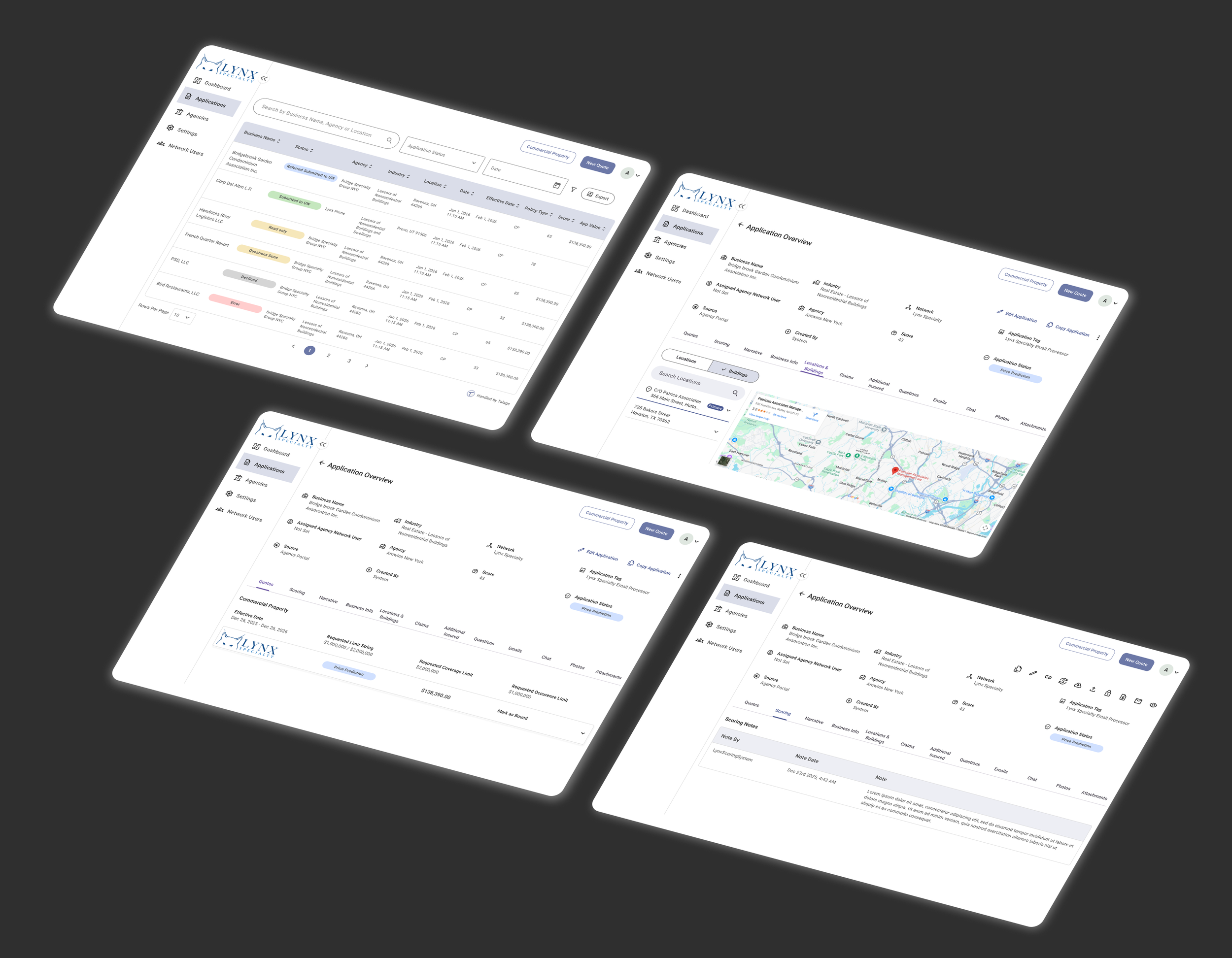
How stakeholder collaboration accelerated delivery
One pattern I've learned to rely on in compressed timelines: embed decision-makers earlier than feels comfortable. Most designers present work to stakeholders after it's polished. On a 9-week timeline, that's too late to absorb substantive feedback.
I ran weekly reviews with the underwriting operations lead and the compliance manager — not to show finished work, but to validate direction while it was still cheap to change. In week 4, the compliance manager raised a concern about how we were surfacing waived conditions. We caught it in wireframes. Resolving it cost half a day. Catching it in visual design would have cost three days. Catching it in development would have been a sprint reset.
Challenges & Trade offs
What worked
— Twice‑weekly working sessions with key decision‑makers
— Reviewing rough work early instead of waiting for polish
— Explicit scope agreements, documented and distributed
— Sharing designs with developers as work progressed, not at the end
What I'd do differently
— Bring underwriters back for a mid‑fidelity testing round
— Relied too heavily on stakeholder feedback for coverage configuration
Tradeoffs I made and accepted
Every project has things that don't ship. On a compressed timeline, those need to be explicit decisions — documented and agreed on — rather than incomplete work that surfaces as a surprise.
Decision
Status visibility + action hierarchy
Bulk submission review
What was deferred, and why
Both shipped. Highest‑friction items identified in research, with sufficient stakeholder alignment to move quickly.
Underwriters managing high‑volume accounts needed multi‑select actions. The interaction model was complex and would have added 2–3 weeks. Deferred to v2 with documented specs.
Status
Shipped
Deferred
Inline field commenting
Useful for collaboration, but the underlying data model needed engineering architecture outside the timeline. Scoped to the escalation thread instead.
Partial
Mobile‑responsive layout
Underwriters work at desks — mobile usage was 2% in analytics. Not designing for it in v1 was an informed decision, not an oversight.
Deferred
Impact
59%
Reduction in average time to complete a submission review
91%
Of escalation now completed in-platform vs via email
0
Compliance flags related audit trails in first week
Client Review
"I've been working with Shreya on a complete redesign of a core system that we will be using for submission management across our company. Shreya has exceeded all expectations as a UI/UX designer. She hit the ground running giving guidance and recommendations from day 1. Within weeks, we had a fresher, cleaner look and feel to the platform that was much easier to use and more visually appealing to the end users.

Anyone who has ever worked with Mission knows that we run a million miles an hour. Shreya jumped right in and took the initiative to find stakeholders to meet with and quickly set up touchpoints to familiarize herself with the product to further enhance the changes she could suggest for the team.

Shreya has also done a great job asking questions and being responsive with any requests or clarifications from the developers. Her partnership has truly made this project a success. The team has received incredibly positive feedback on the changes. Her help has been invaluable. I would highly recommend working with Shreya on any UI/UX projects that you may have. She's an absolute professional and proven herself an expert in her field. I can't say enough good things about her. Thank you for all your hard work, Shreya!!"
— Caitlin Brown, Sr Product Manager @ Mission