
TitleMax Design System
Single source of truth for 5+ product surfaces - colors, buttons, typography and many more components, bulit once and reuse everywhere.
Background & Problem
TitleMax is one of the nation’s largest title lending companies. Every day, TitleMax helps thousands of people get the cash they need with a title loan, title pawn, or now in selected states, with a personal loan.
TitleMax's design and engineering teams were starting nearly every new initiative from a blank file. There was no shared library of components, no documented grid or type system, and no single source of truth for how "TitleMax" was supposed to look or behave across products.
The cost wasn't just visual inconsistency — it was velocity. Every project absorbed the same setup work: rebuilding buttons, form fields, and layout grids, then re-litigating the same style decisions the last project had already made.
Exploration
Before designing a single component, I needed to know what already existed and where it broke. I did an audit existing site, to get screenshots of inconsistent UI elements across the board.
You don't start building a house without it's foundation so the same thing applies to design systems. Our foundations supported brand logos, grid systems, typography, and color systems.
Grid & Spacing
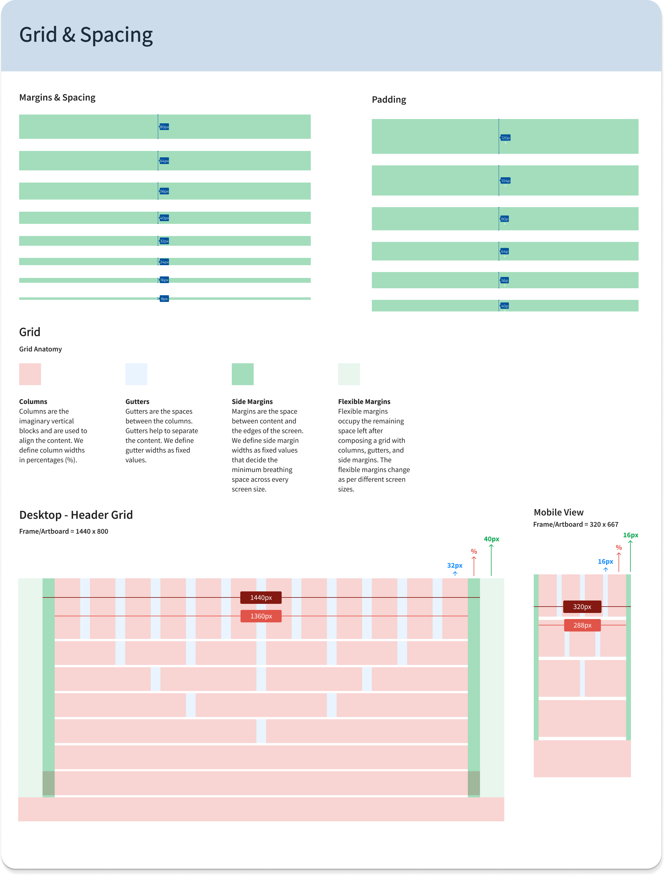
I built the grid around an 8px base unit and a 12-column responsive layout because TitleMax's products span desktop kiosk screens in-store and mobile web, so the grid needed to hold up at both extremes without redesign.
Colors
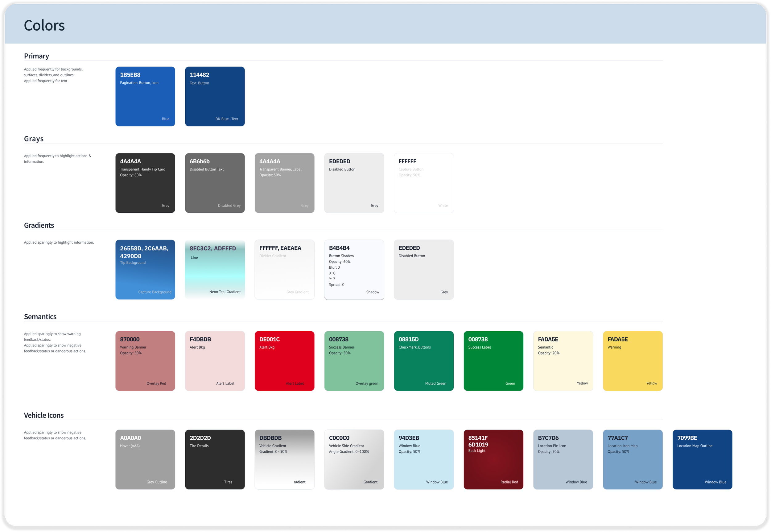
Color roles were split into primary, greys, gradients, semantics, icons rather than just brand swatches, so that a developer implementing a warning state or disabled button didn't have to guess which brand blue applied.
Typography
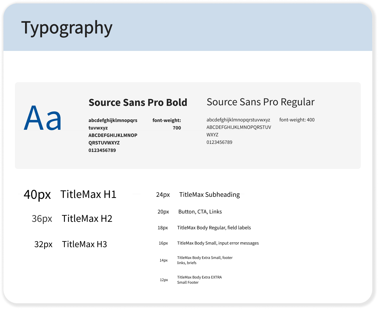
Type styles were built as two paired sets — one for desktop, one for mobile — using Source Sans Pro at the actual scale, e.g. 40/32/24/16px, so text styles for headers, body, inputs, and buttons stayed consistent regardless of which product implemented them.
Here’s how the system is organized and why
Rather than building components one-off as products requested them, I organized the library around global structural, content, data, and utility types — so a designer picking a component knows immediately what context it belongs in and what decisions are already made for them (states, spacing, sizing).
Key components included buttons (with full state coverage — default, hover, disabled, loading), sliders for loan amount selection, thumbnail and illustration sets for vehicle/loan visuals, and standardized text fields and logo lockups.
Button
The Button is the highest-traffic interactive primitive in the product: it appears in forms, modals, application flows, and marketing CTAs. This spec consolidates it into one component with four axes of variation — intent, emphasis, size, and width — rather than the loose set of one-off buttons that existed before.