
Tractor Supply Design System
Tractor Supply Co. engaged Sogeti to revamp their digital presence with a scalable design system, aiming to streamline design, improve collaboration, and enhance user experience across all products.
Background & Problem
The TSC Design System ensures brand continuity and provides a shared component library for multiple platforms. Though initial costs are high, the return on investment is significant due to reduced future development and elimination of redundant code.
The client had a hard time managing their complete digital footprint across various places. Because of this, their brand suffered from visual inconsistencies, design debt, and deprecated code. There was no single source of truth when it came to design guidelines or decision making.
Laying Foundation
Critical to the success of the system was the alignment of all our teams on the foundational elements for each brand. One of the first tasks was deciding on the typography and the color palette. I presented a few options to the design team at TSC, aiming to encapsulate a modern, vibrant brand while also taking into account the current state of brand.
Our foundations supported our layouts, colors, typography, spacing, elevations and iconography. I proceeded to set up the foundations with a series of page templates.
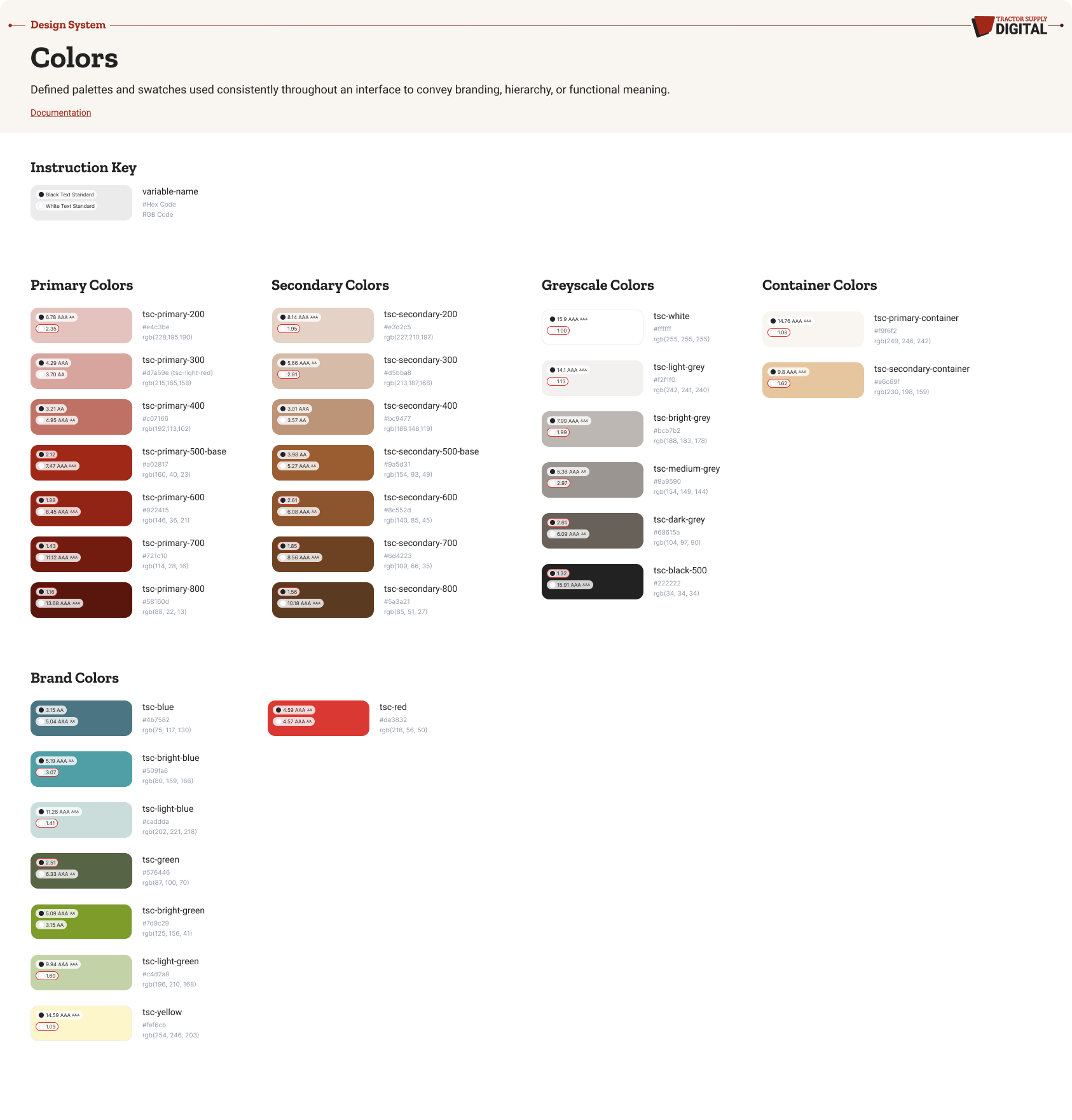
Color is an important component of how our brand is perceived. Our color system offers options that allow for creative expression. The palette stems from an exploration of colors that appear in nature and all the activities we support.
Consistent and appropriate use of these colors will create a strong and consistent visual presence for our brand.
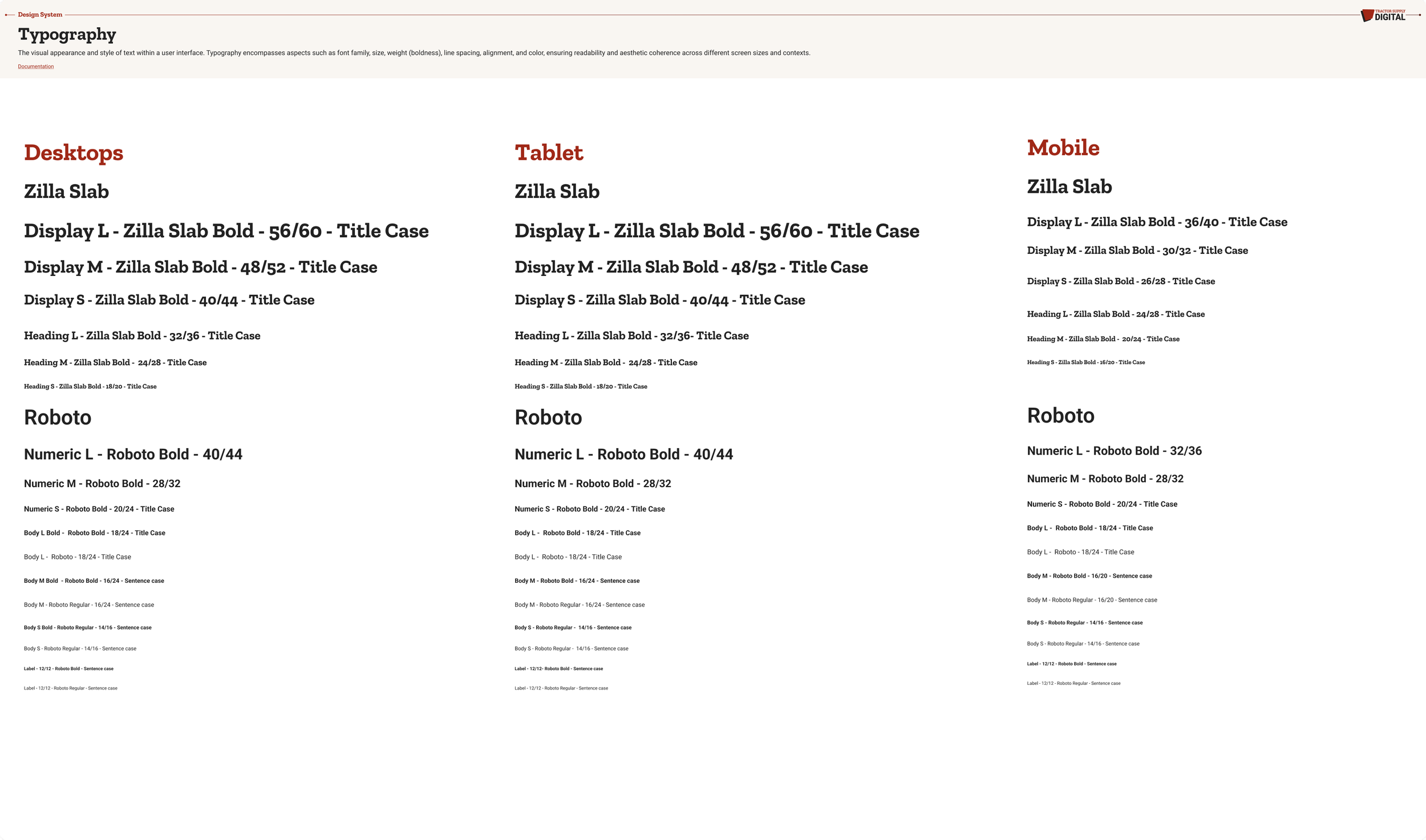
Typography unifies our brand identity with two Google fonts: Zilla Slab and Roboto.
Zilla Slab, our primary typeface, is bold, modern, and playful, matching our logo and tone of voice. Roboto, our secondary typeface, is clean and geometric, ideal for supporting text and long-form copy.
Building Components
The next step was getting started on an ever-developing set of components. Throughout the design system we reference different component types such as global, structural, content, data, and utility. It was critical to define the differences between component classes so that design decisions are efficient and accurate based on the context of the page.
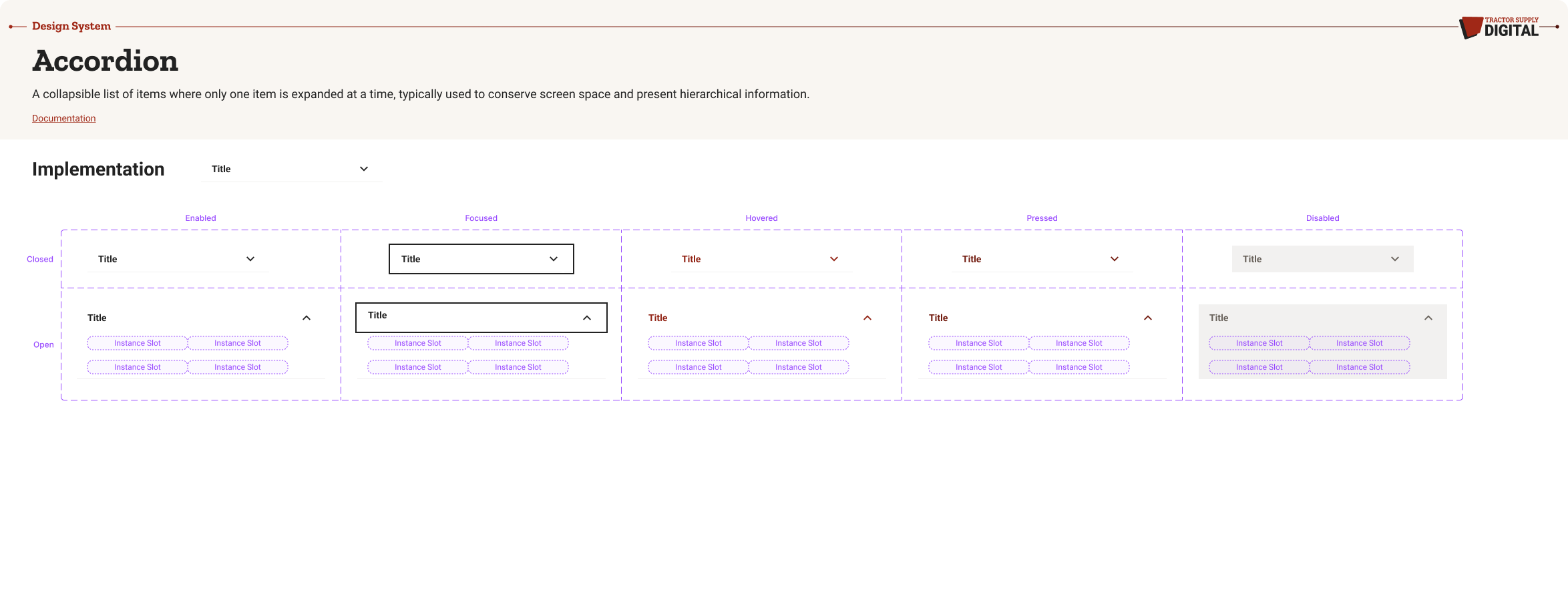
A collapsible list of items where only one item is expanded at a time, typically used to conserve screen space and present hierarchical information.
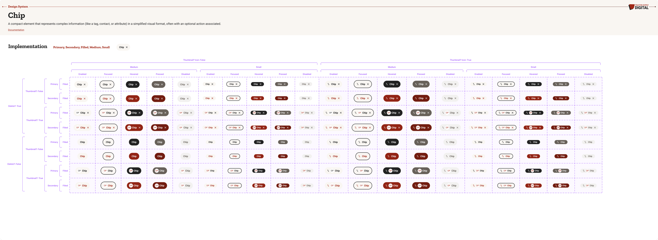
A compact element that represents complex information (like a tag, contact, or attribute) in a simplified visual format, often with an optional action associated.
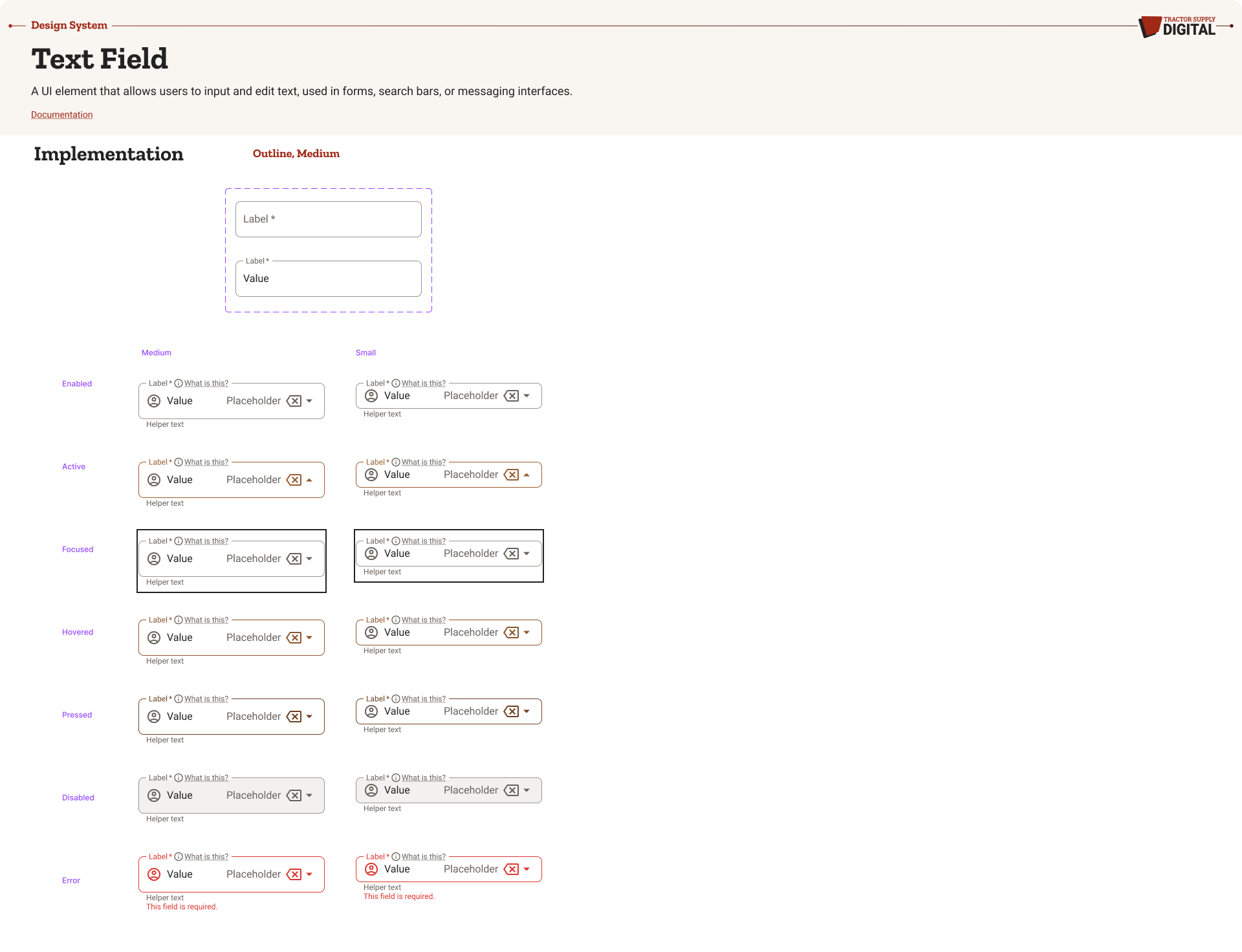
A UI element that allows users to input and edit text, used in forms, search bars, or messaging interfaces.
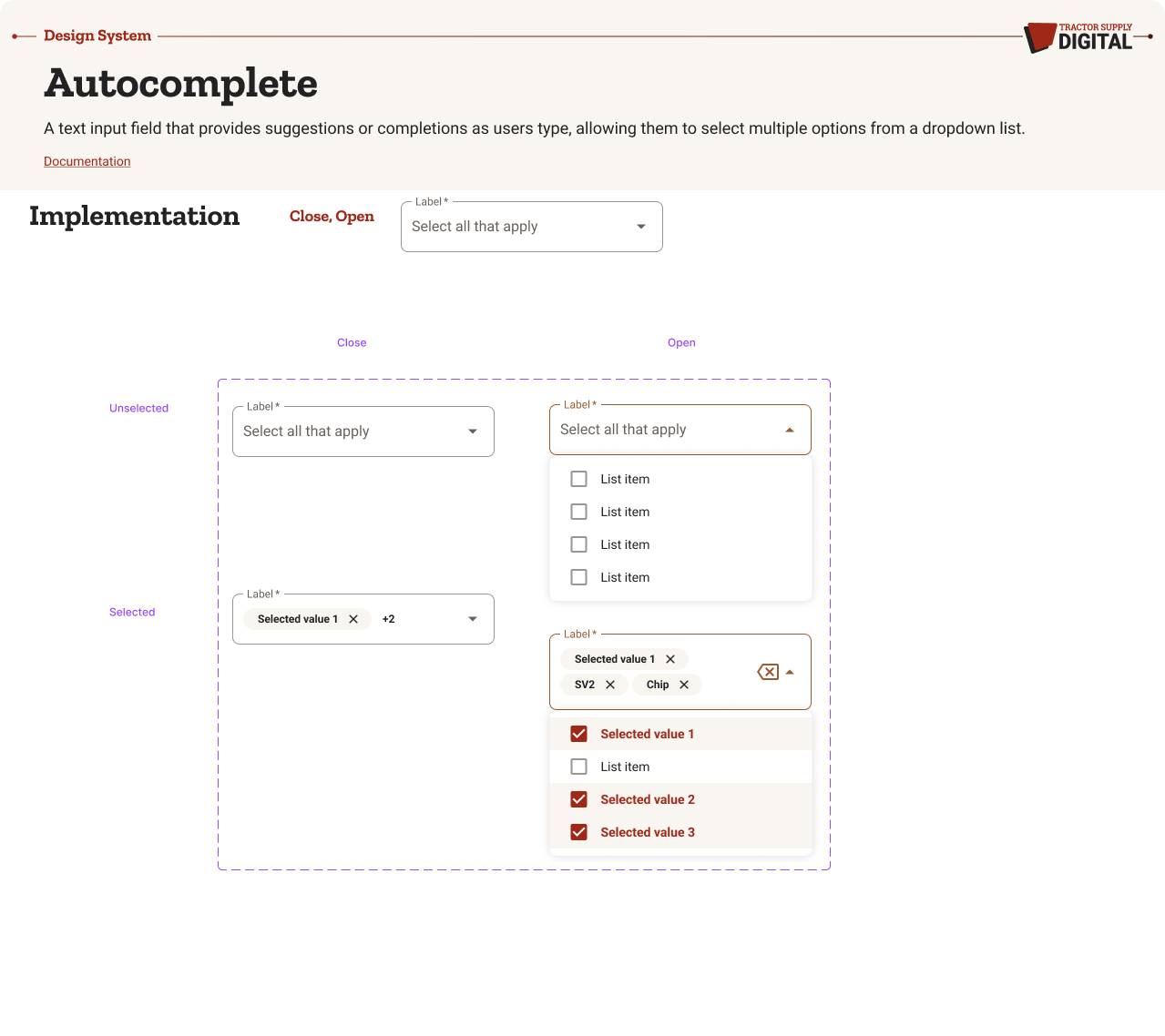
A text input field that provides suggestions or completions as users type, allowing them to select multiple options from a dropdown list.
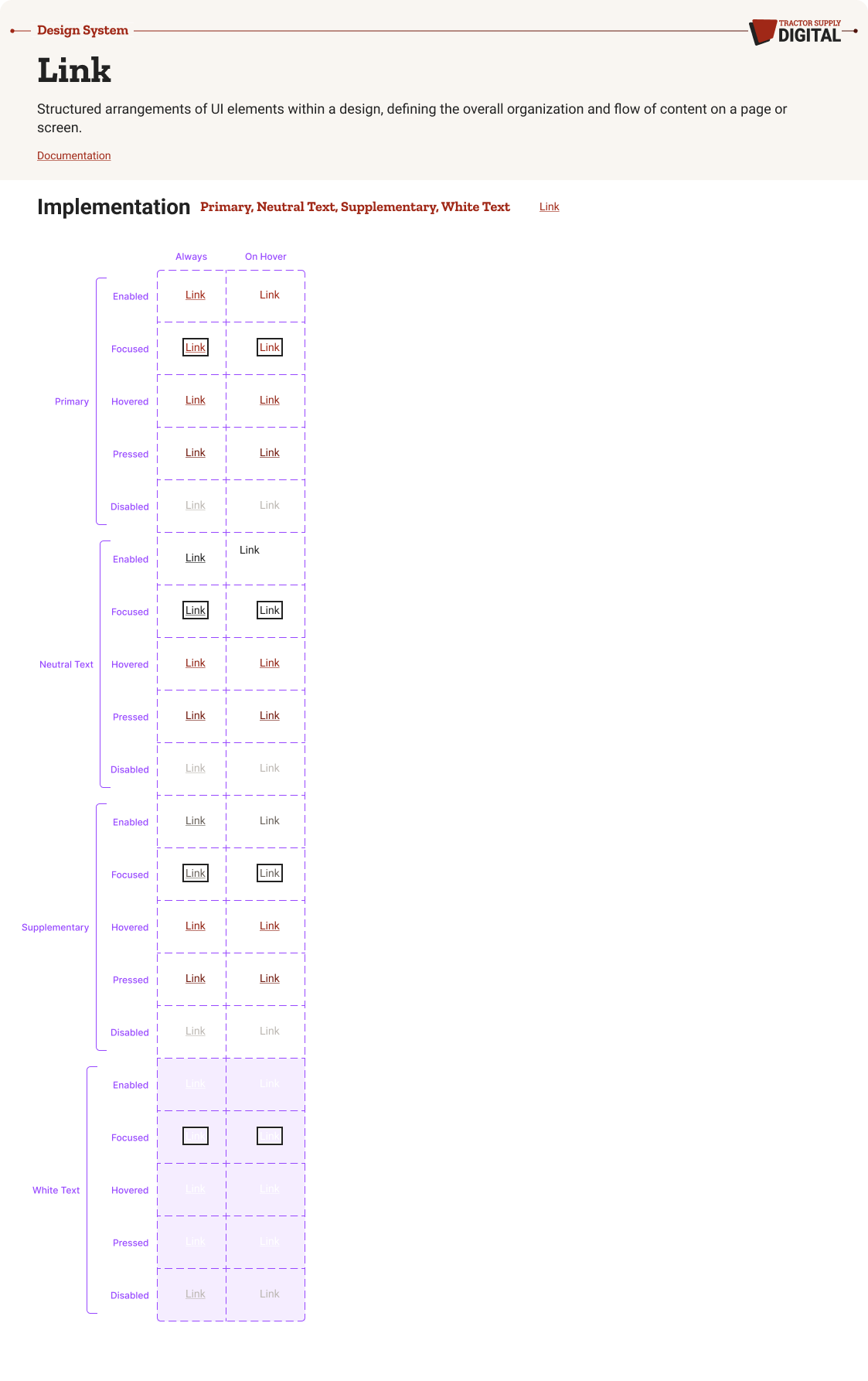
Structured arrangements of UI elements within a design, defining the overall organization and flow of content on a page or screen.
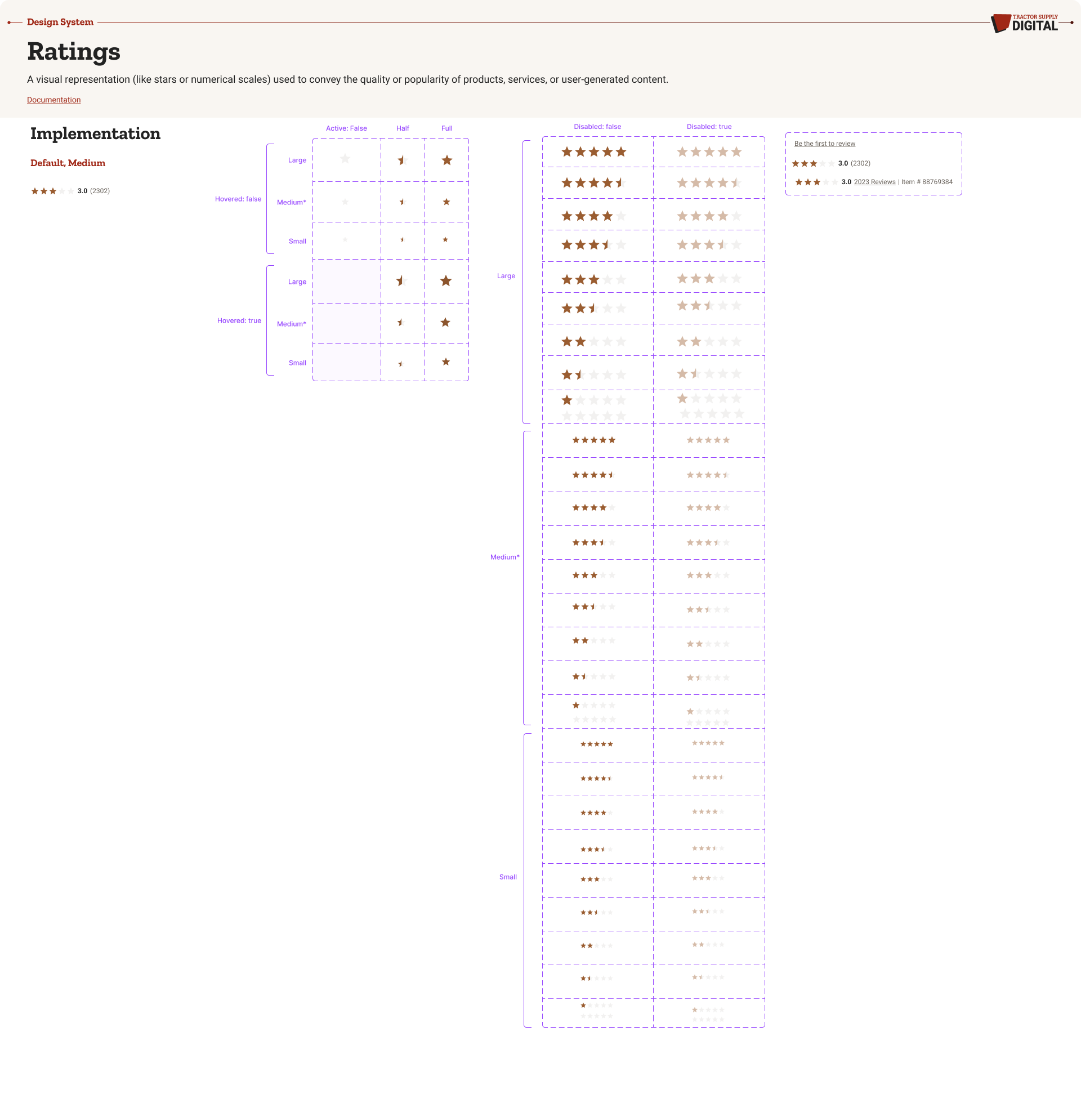
A visual representation (like stars or numerical scales) used to convey the quality or popularity of products, services, or user-generated content.
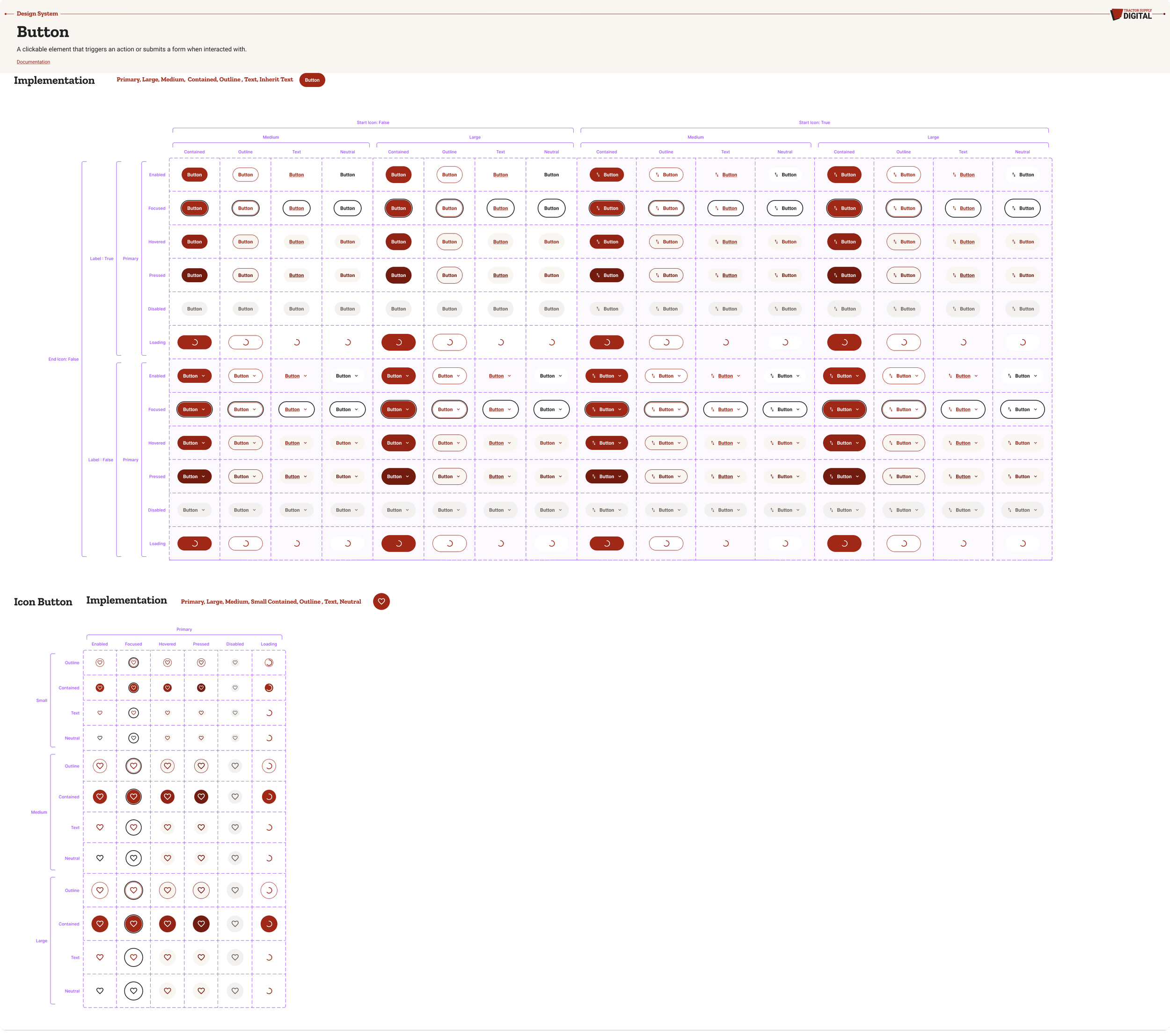
A clickable element that triggers an action or submits a form when interacted with.
Patterns
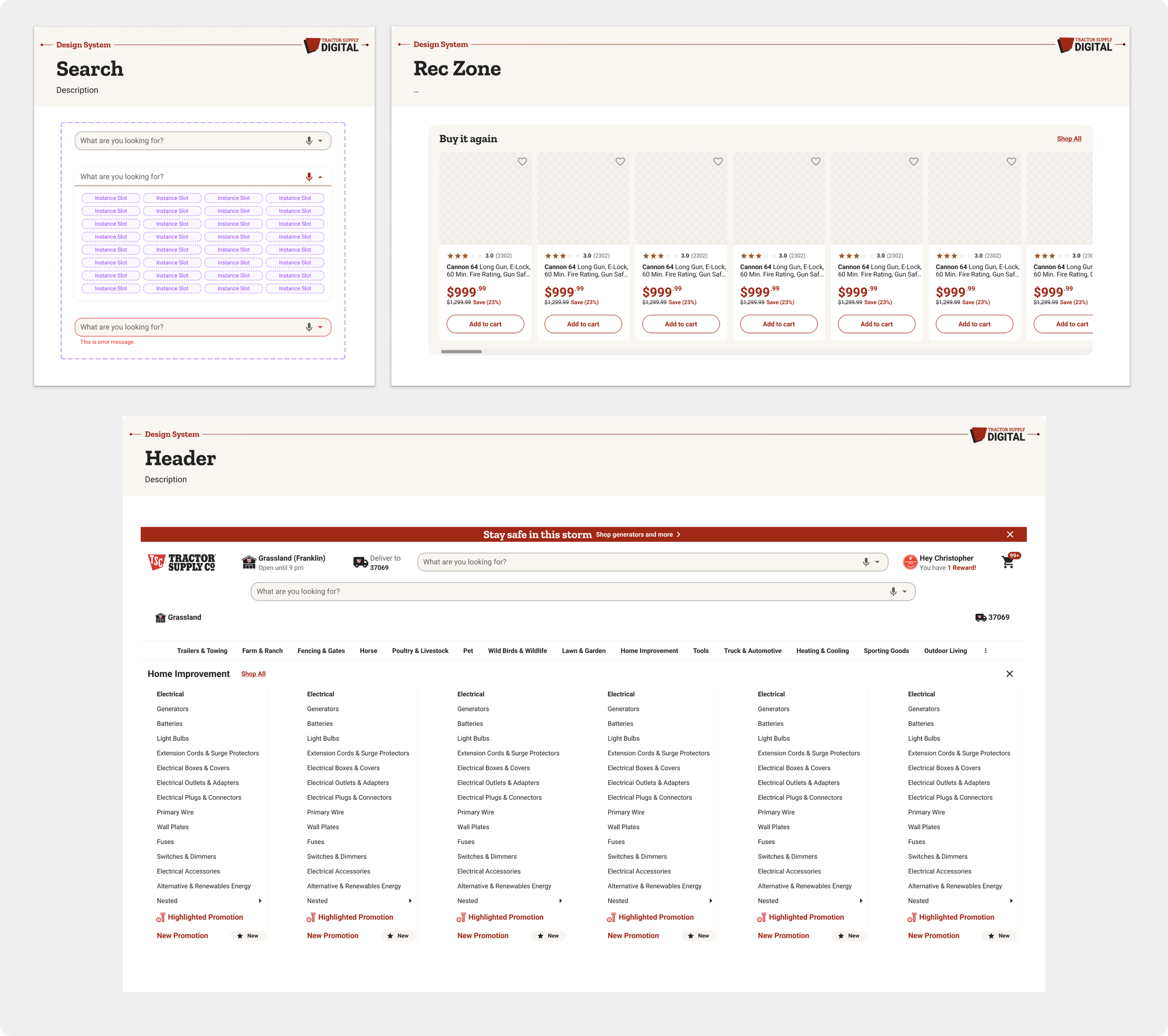
Patterns are used to show reusable combinations of components that address common user objectives with sequences and flows. While not every possible pattern was developed, this documentation served as the basis for our customers most common needs.
Impact
Single source for viewing foundations, components, patterns, and styles.
Enables scalable redesign and management of projects.
Frees design resources to focus on complex problems instead of visual tweaks, ensuring consistency.
Quickly replicate designs using pre-made components.
Eliminates redundancy and inconsistency.
Reduces wasted design and development time due to miscommunications.