
Tractor Supply Co Redesign
TSC is a major American retail chain that offers products for home improvement, agriculture, lawn and garden maintenance, as well as livestock, equine, and pet care.
As I lead designer I was brought in to work on redesigning there Product Listing and Product Detail page redesign.
Background & Problem
Tractor Supply Company (commonly known as Tractor Supply or TSC) is a major American retail chain that offers products for home improvement, agriculture, lawn and garden maintenance, as well as livestock, equine, and pet care.
The existing website needed a modernized layout and a streamlined user experience for shopping via the Product Listing Page and Product Detail Page. Since the primary revenue categories were Gun Safes, Mowers, and Poultry, we concentrated on redesigning these three major categories first.
Exploration
UX Benchmarking via Baymard Tool
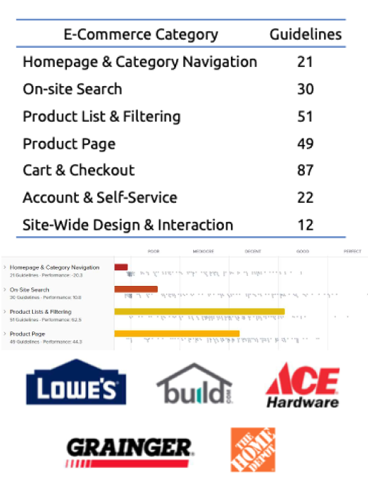
Baymard provides UX with 650+ design guidelines and 215,000+ performance scores used by many of the world’s leading sites. It has large database of research which includes 50,000+ UX performance ratings on 244 top-grossing e-commerce sites across 700+ different UX elements and components.
Rated e-commerce website on 7 categories and a total of 272 UX guidelines in the Home Improvement & Hardware Industry
A score for each category and an overall score was produced.
These scores are shown in comparison to 138 major e- commerce sites within the Home Improvement & Hardware Industry.
Recommendations
Enhance the layout and filtering of the Product Listing Page (PLP) to ensure a positive user experience.
Remove unnecessary information from the Product Detail Page (PDP) and emphasize essential information. Crucial data should be easily accessible and presented clearly and concisely for users.
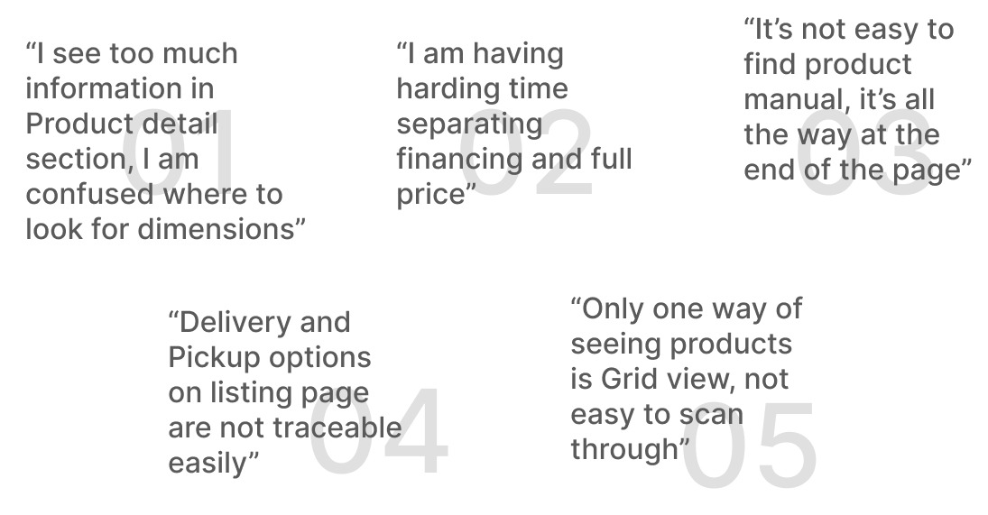
Usability Tests
5
User Tested
20
Usability Tests
65%
Tests failed
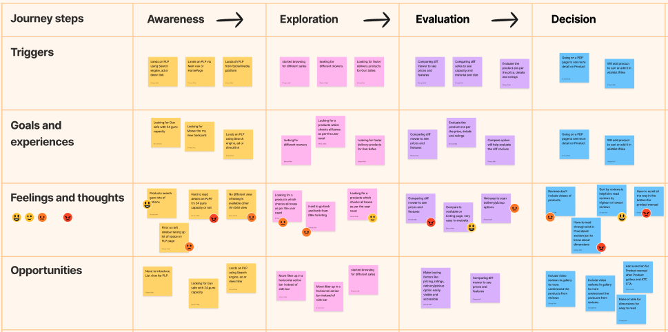
Customer Journey
Using quantitative and qualitative analysis, we developed a user journey map to better capture the process of searching for a right product from listing page to exploring detail on PDP page along with the users emotions at each stage in the process.
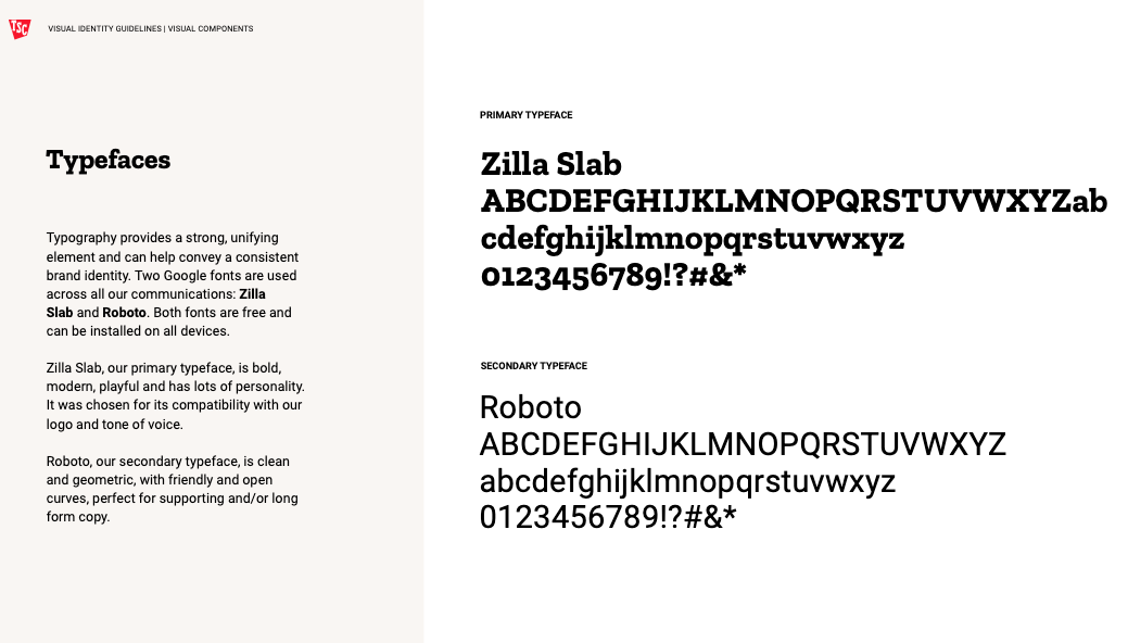
Design Experience
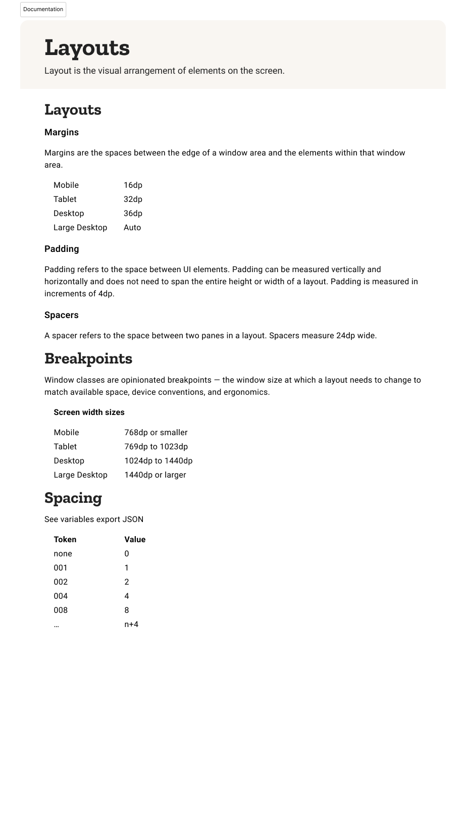
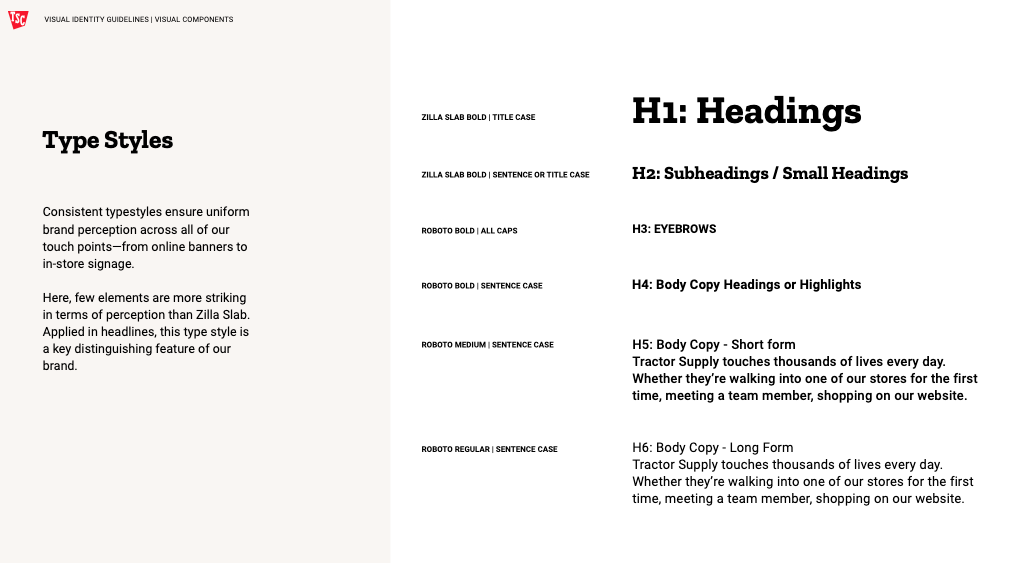
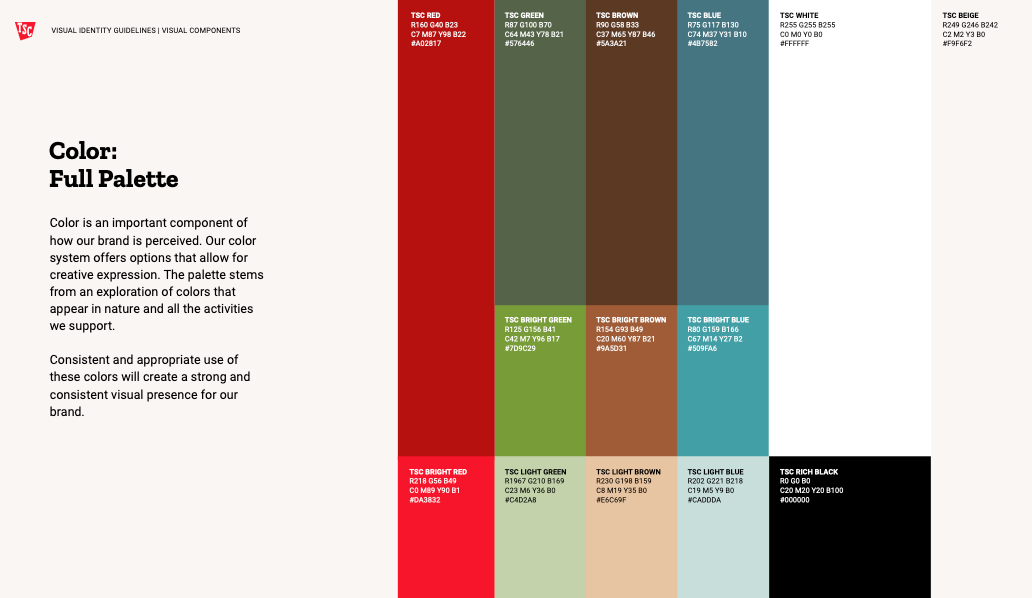
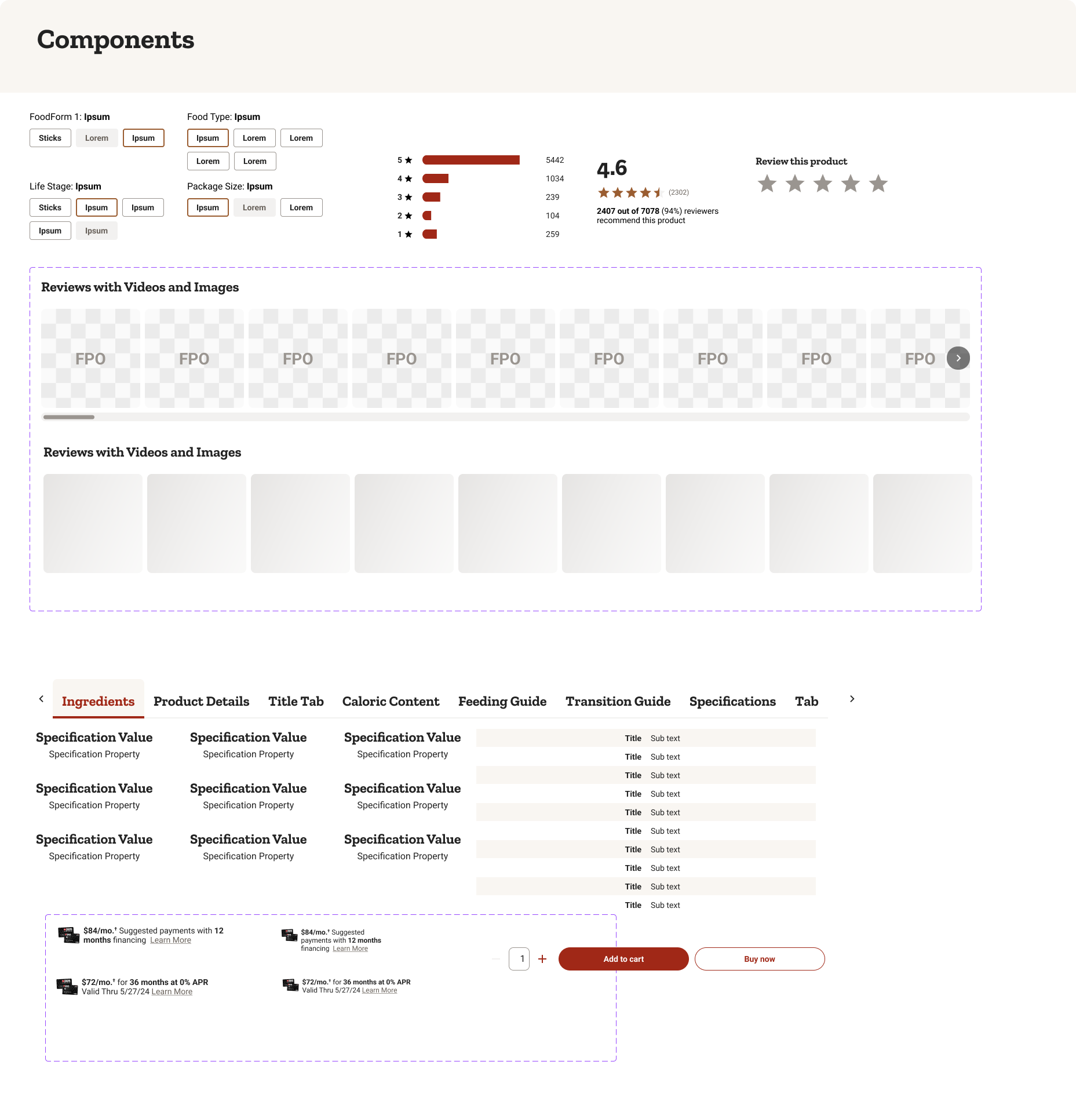
Time to make it pretty! We came up with a simple style guide prior to developing a mid and hi-fi prototype.
We decided to introduce brown and green brand colors as secondary color and keep with the red color scheme of the original website, but revamp it to have a more modern spin.
Desktop Designs
Mobile Designs
Impact
This redesign project taught us the importance of learning and iterating early and often prior to the development phase. Working under limited time allowed us to limit scope and focus on the critical aspects of the website. That said, the areas that we would like to focus on improving in the next iteration are:
Extensive user testing on hifi prototypes
More data-driven iterations
Improve product listing page filter functionality to narrow down products more efficiently
Improve the process product detail organizations to add more feature to our website
Overall, we are pleased with our final product and excited about the iterations to come.
8
weeks
3
Iterations
24
Screens
100%
Improved
Client Review
"Shreya worked with us on both our design system and Product Detail Page (PDP) redesign. She brought a strong understanding of UX best practices, delivering designs that balanced functionality and visual appeal. Her collaborative approach and clear communication ensured seamless integration with our cross-functional teams. Shreya also provided creative solutions to complex design challenges and played a key role in the adoption of the design system across the organization. Her work has driven measurable improvements in our user experience and engagement. I highly recommend her for future projects."— Christine Curry, UX Manager @ Tractor Supply